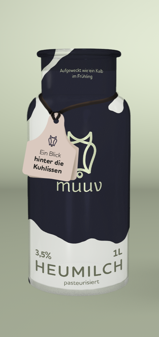
muuv - dairy branding
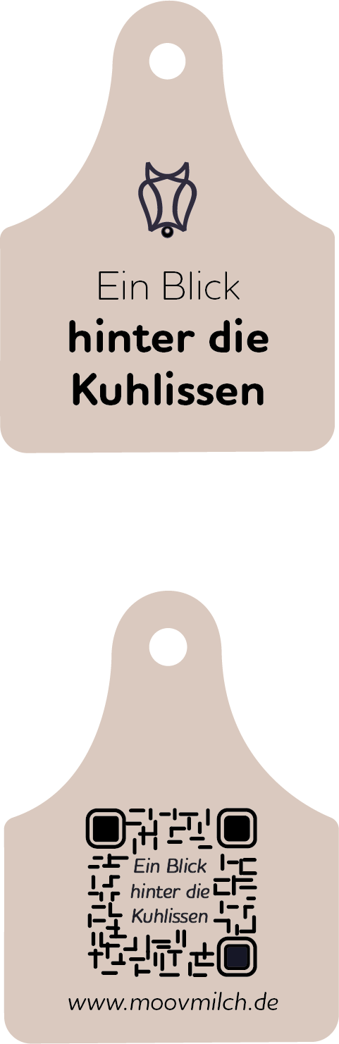
The dairy industry is surrounded by many ongoing discussions, and I wanted MUUV to make room for them instead of ignoring them.
Inspired by cattle ear tags, each bottle includes a QR-Code linking to further information about the brand and modern dairy farming, giving consumers the opportunity to learn more if they choose to.
The Brand System
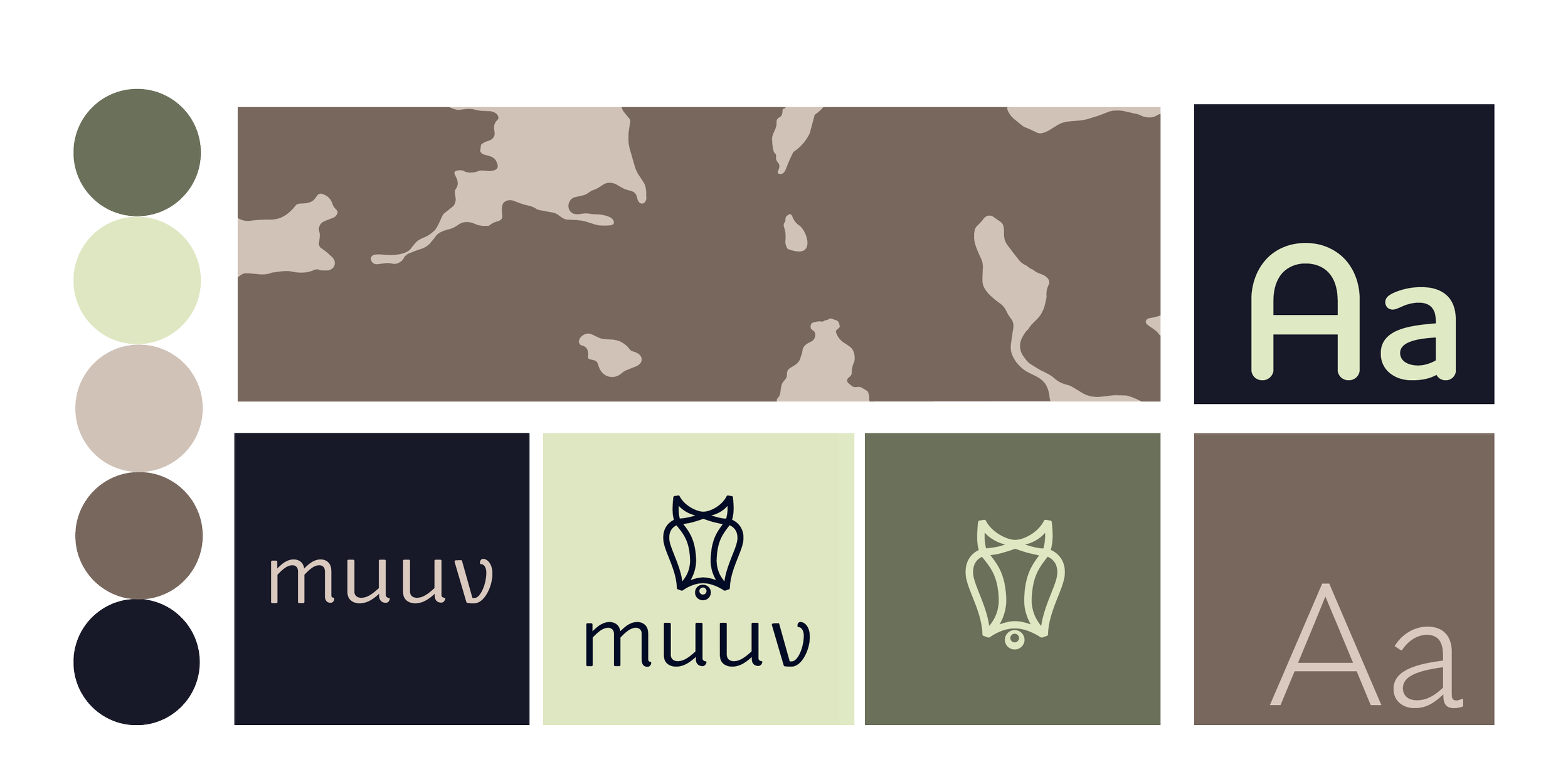
The colour palette takes its inspiration from agriculture, but avoids the colours that are typically associated with dairy branding. Instead, it uses combinations that feel less expected while still fitting the subject.
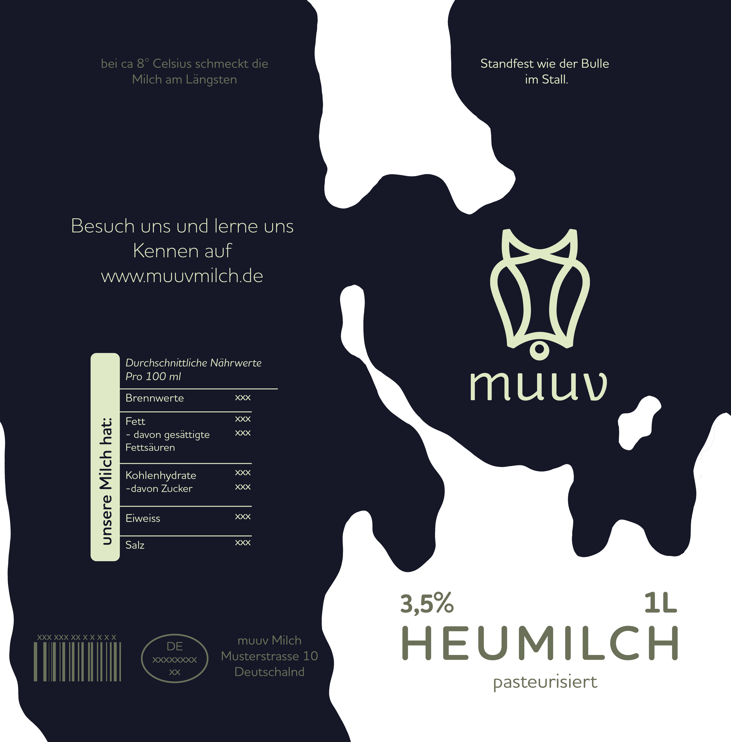
The same idea carries through to the patterns. Inspired by cow markings rather than literal illustrations, they reference the product without becoming the main focus.
Milk alternatives have changed the way the dairy ilse looks but traditional dairy brands often still rely on the same visual they've used for years.
MUUV started with one question:
How can a traditional dairy brand catch up to the milk alternatives?
The Packaging
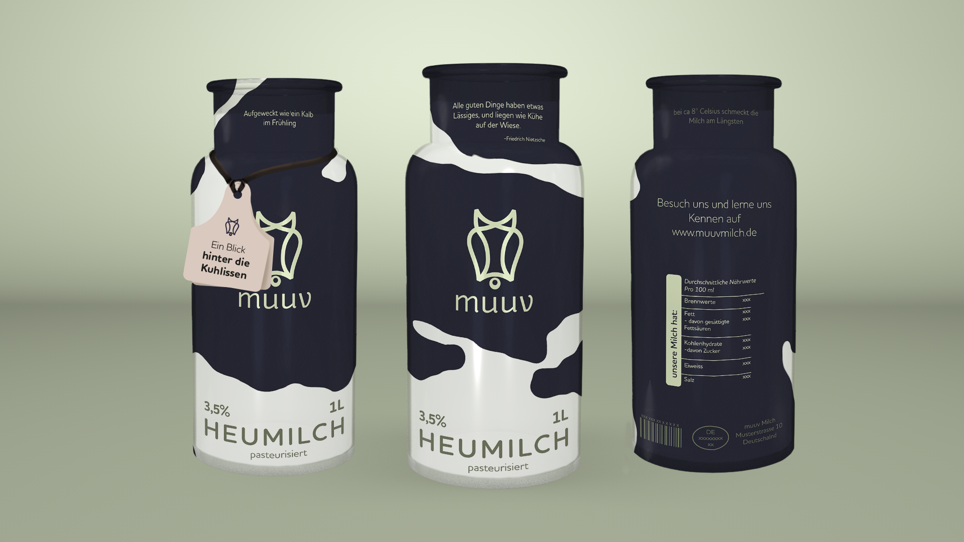
The bottle shape is based on traditional milk cans, reinterpreted in a simpler and more contemporary form. It keeps a connection to the product's origins without feeling old-fashioned.
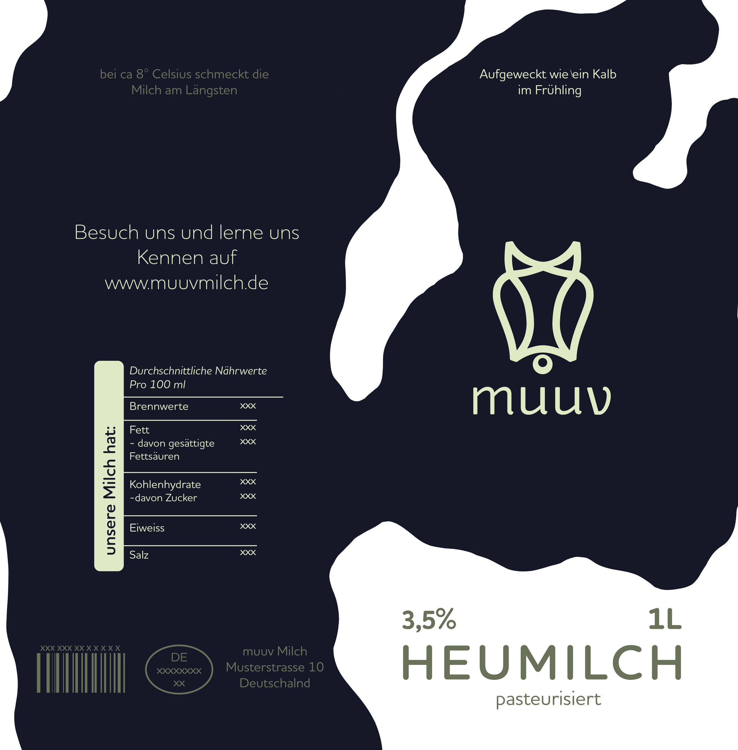
Instead of a conventional front label, the bottle is wrapped in a full shrink sleeve. Together with the more minimalist typography and cow-inspired patterns, it turns the packaging into the brand's main visual element.
The combination of colour and pattern creates a system that can easily be extended. By simply changing the colours and reworking the cow pattern, the packaging can be adapted to new products while staying recognisably MUUV.
The Little Extra