Bachelor Project
The Hypomeeting Götzis was set to celebrate its 50th anniversary in 2025, and I decided to take the opportunity to turn it into my B.A. thesis project.
Rather than just creating a new event identity, I wanted to give the Hypomeeting a new appearance that would honour its 50-year history and status as one of the most beloved and successful decathlon and heptathlon meetings..
The Visual Identity
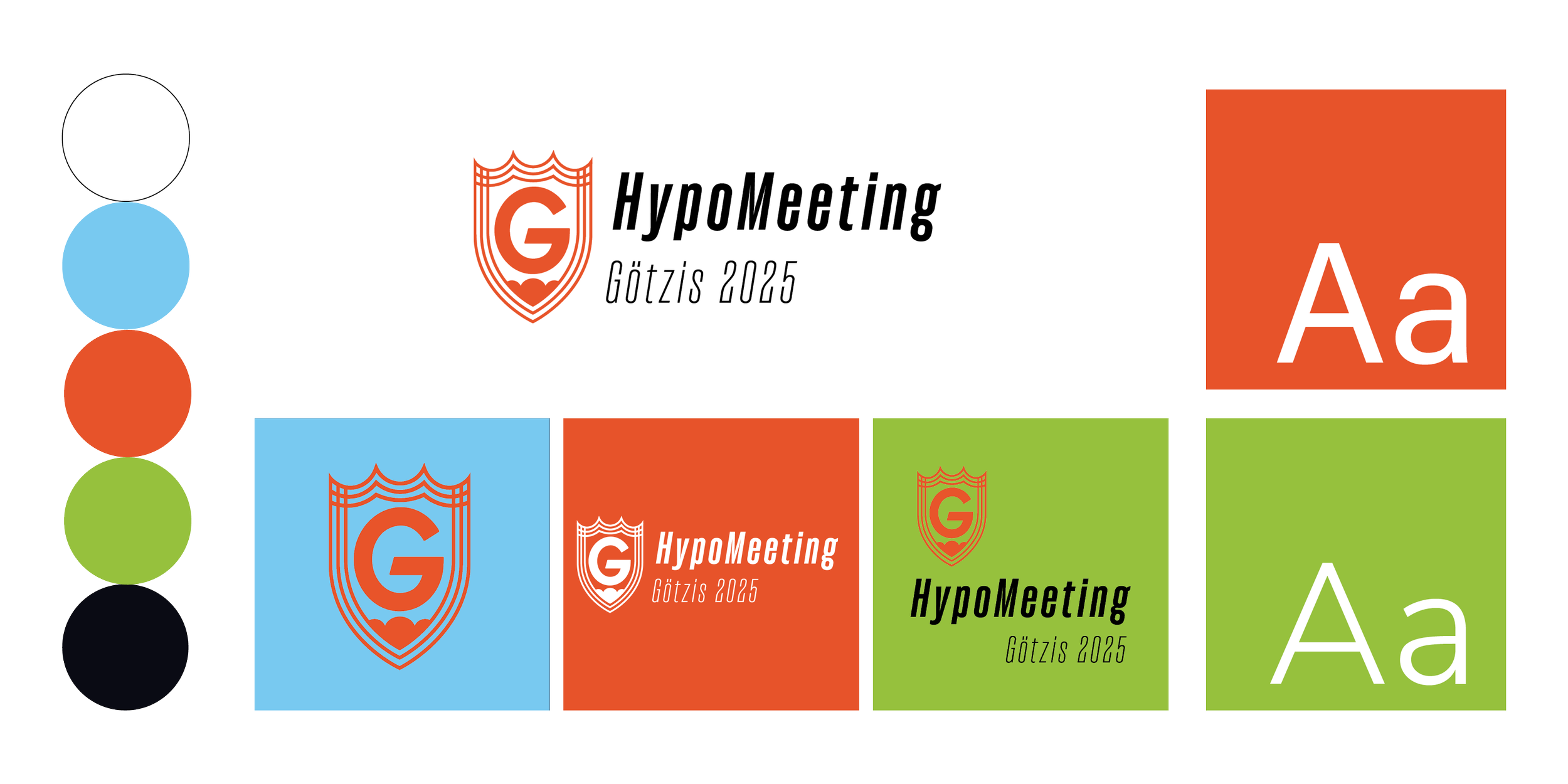
The visual identity takes cues from movement and athletics, using modern, minimalist typography, geometric shapes and a bright colour palette throughout the project.
Rather than using the colours typically found in athletics branding, the palette was built from colours you would naturally encounter throughout a competition day, giving the identity a different look while staying connected to the event.
The Key Visual System
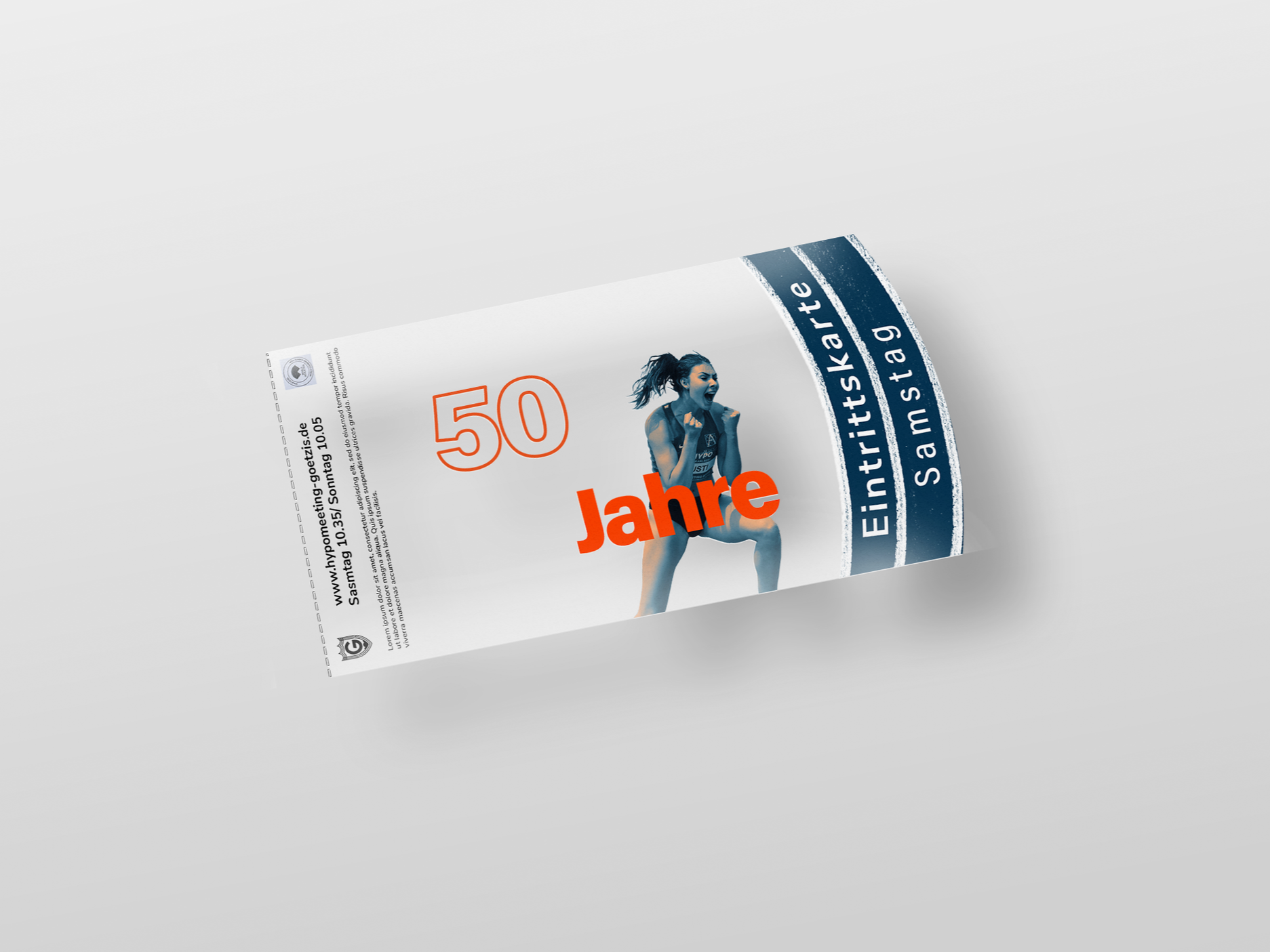
The Ticket Design
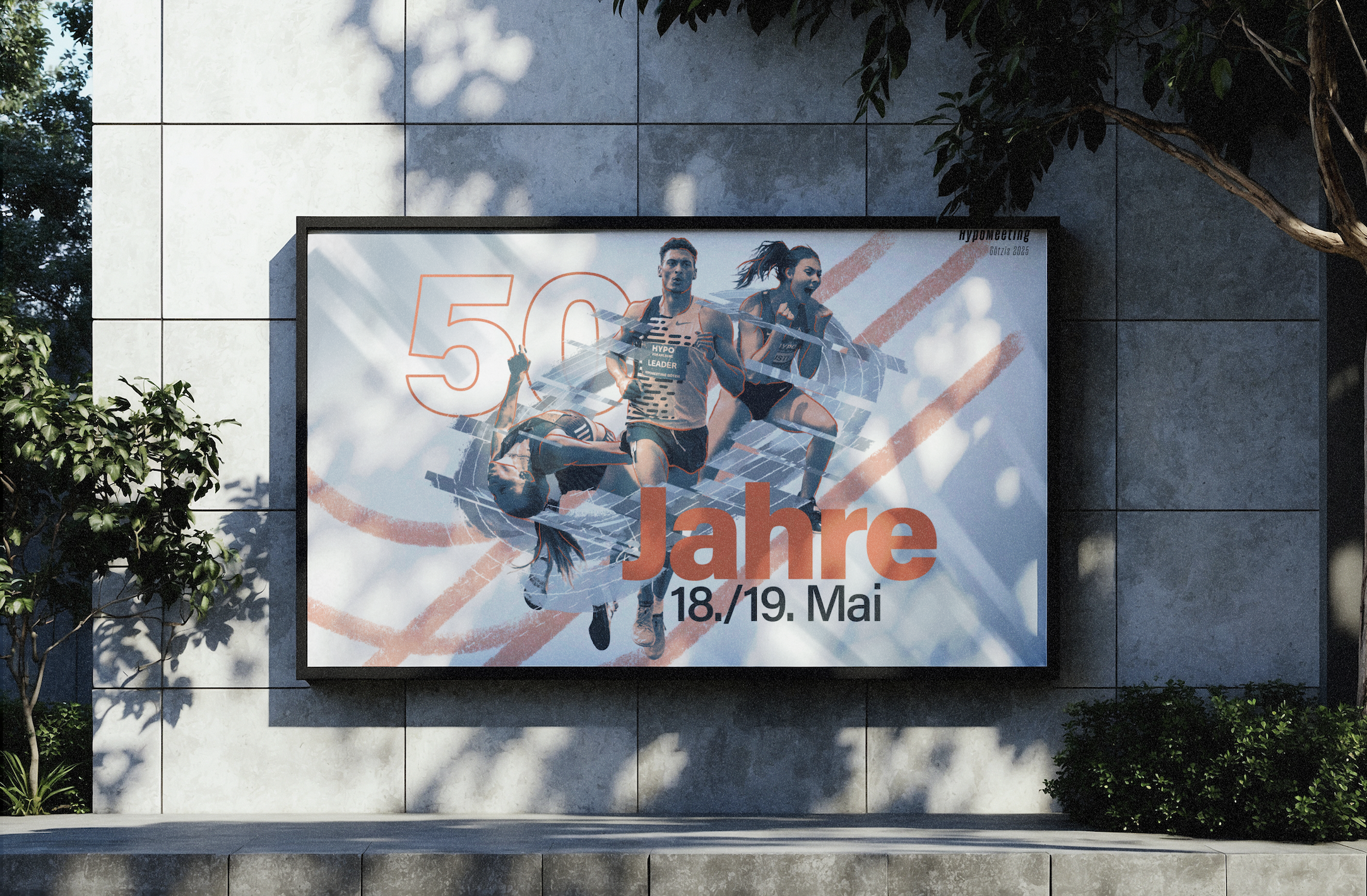
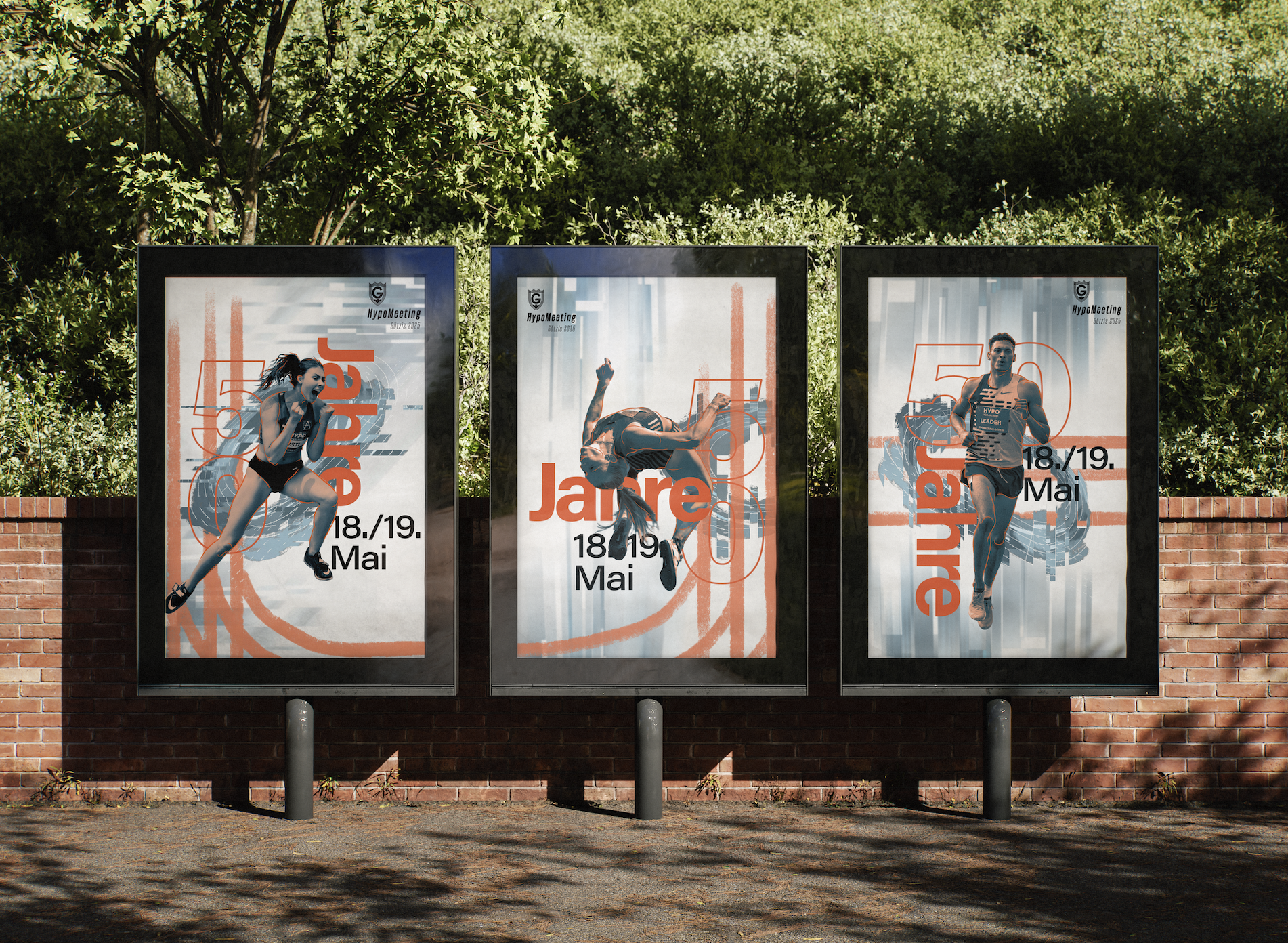
While the banner serves as the main visual, the three main elements can be split up and used as additional key visuals, which helps keep the design varied and dynamic across different platforms.
Reflection
This project challenged me to think beyond logos and graphics and consider how branding performs in a live environment. It reinforced the importance of designing flexible systems that can communicate consistently across many different formats while still capturing the unique atmosphere of an event.
A modular graphic system allows the identity to adapt across a wide range of applications while maintaining a consistent visual language. From promotional campaigns to large-scale venue graphics, the branding creates a unified experience before and during the event.
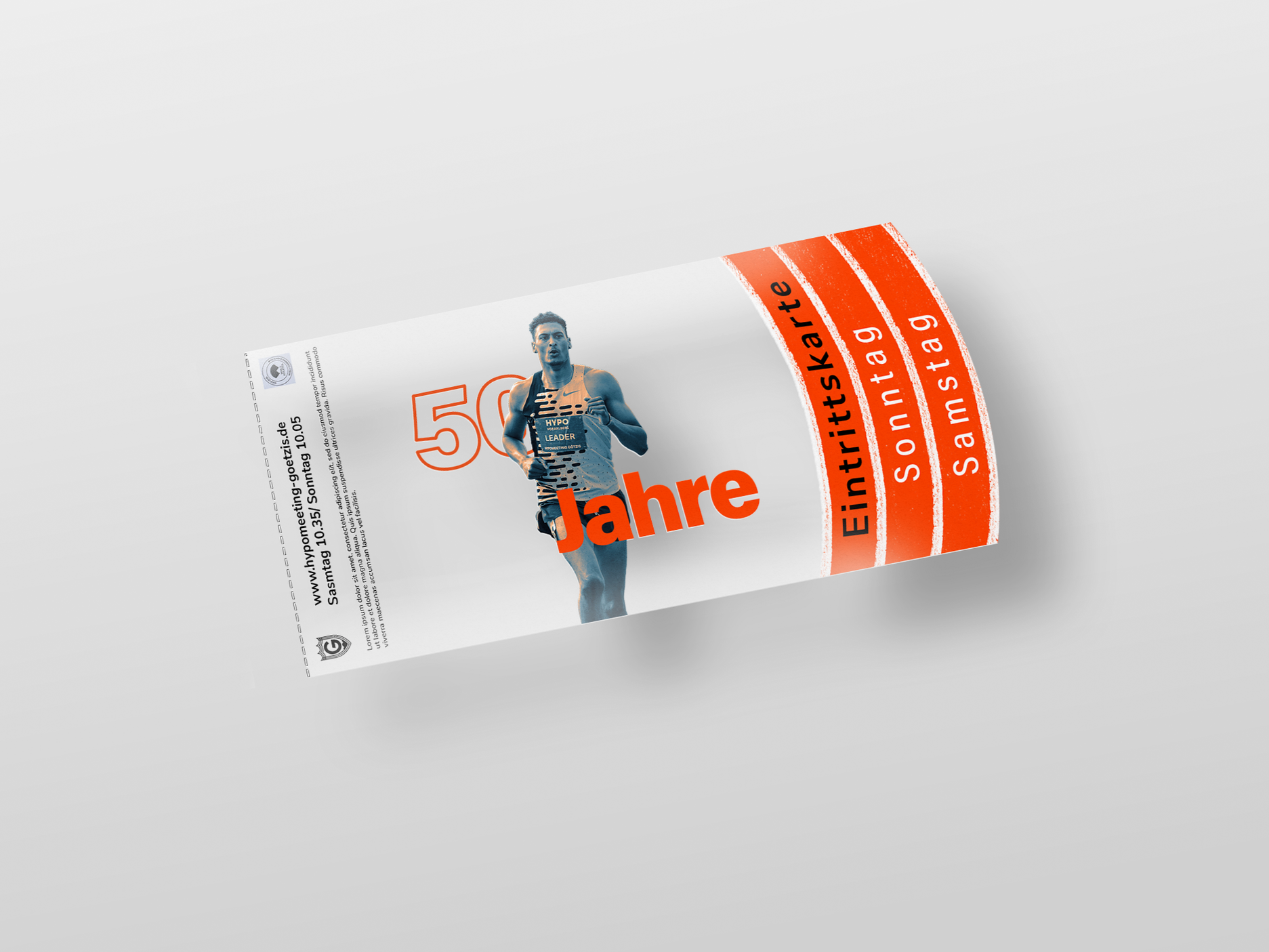
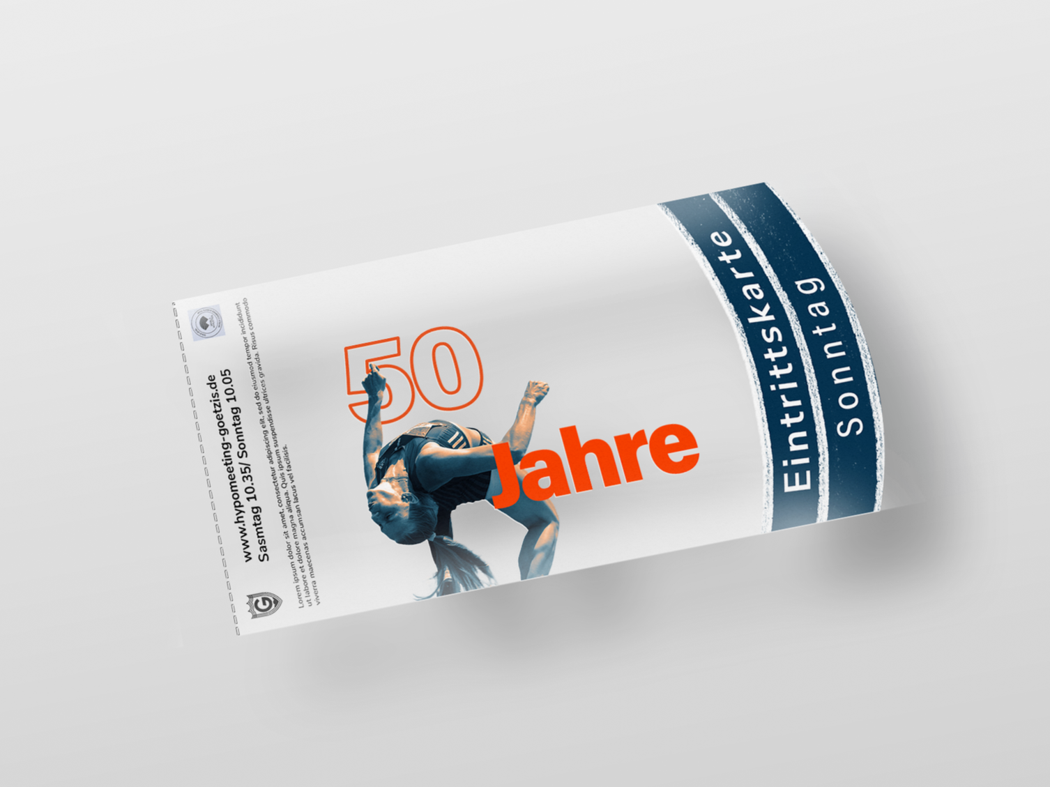
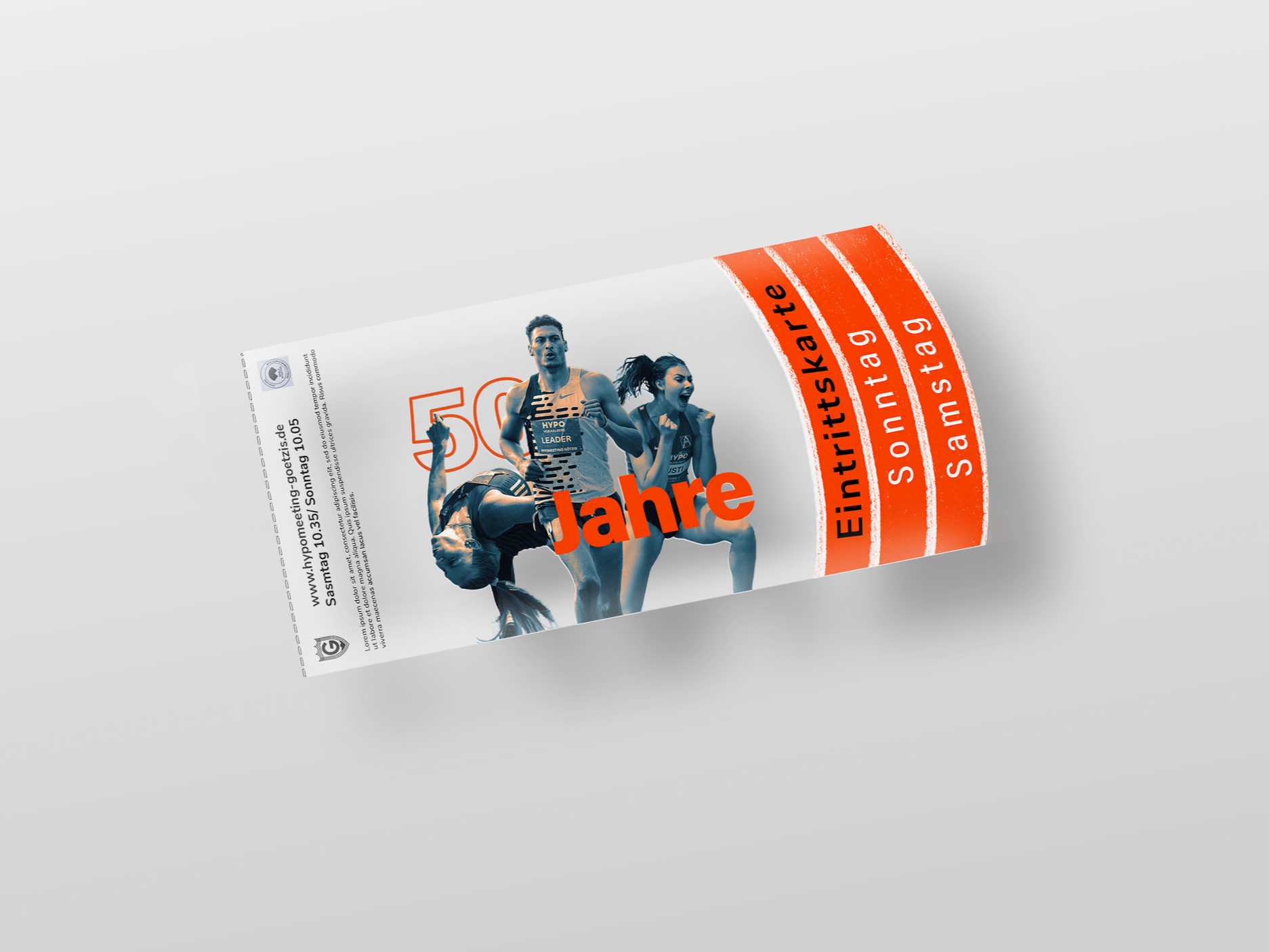
Rather than being purely functional objects, the tickets become part of the overall event experience. They’re meant to encourage interaction between visitors and turn the tickets into keepsakes from the meeting.